From loss to legacy
Designing for emotional impact in the book Ruby, Brave and Undone.
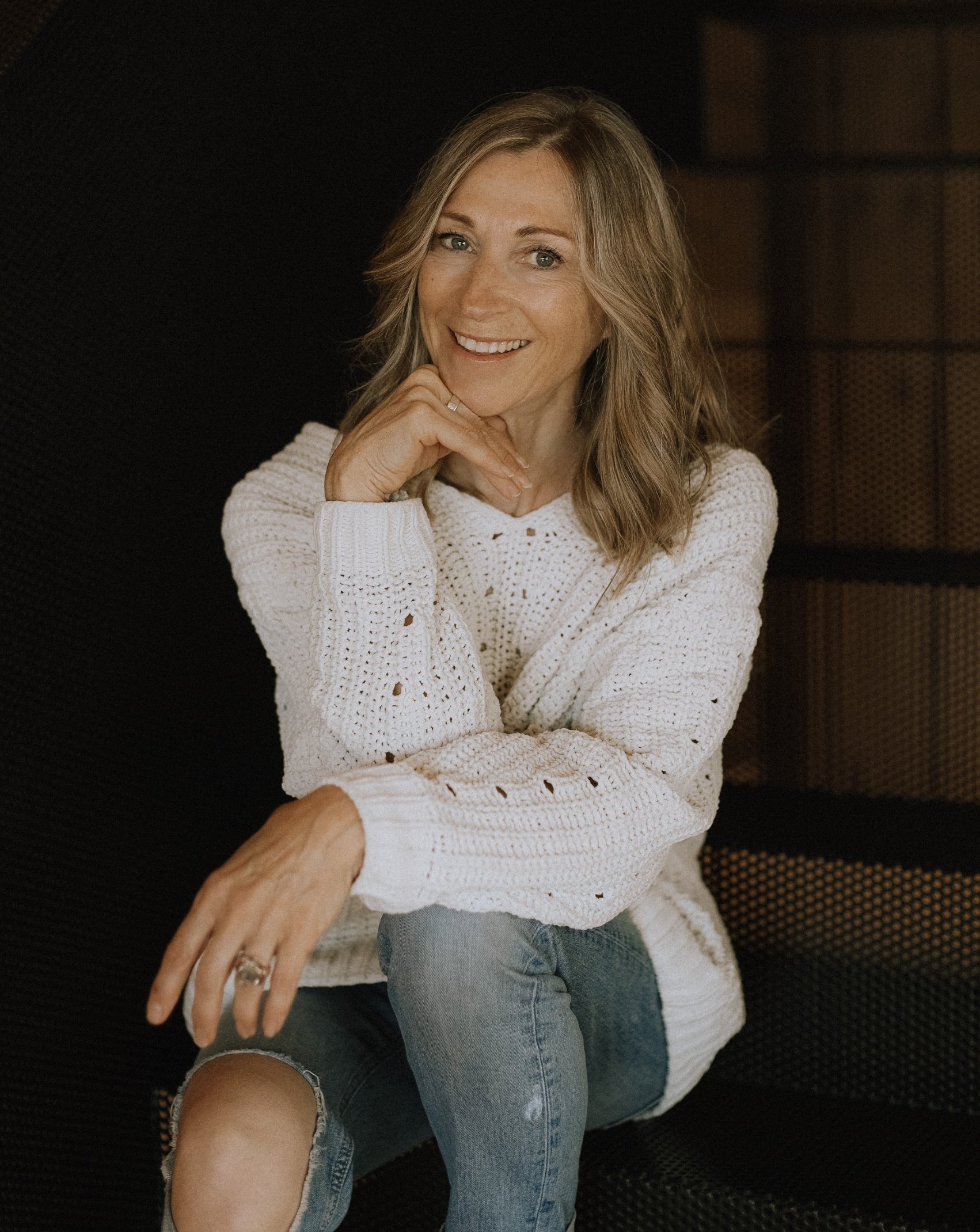
Christine Bryk
March 7, 1966 – September 21, 2023
A dedicated critical care nurse, Christine Bryk actively pursued training in mindfulness and therapeutic communication. Outside her professional life, Christine was a prolific poet, accomplished athlete, and mother of four children. She lived and played along theSouth Shore in Nova Scotia, Canada.
In 2020, while suffering many losses both personally and professionally, Christine poured her heartache into her poetry… and the story of Ruby was born. Sadly, in 2023, just as this book was about to be published, she passed away unexpectedly in her sleep. This book is her parting gift to the world.
The topic of grief and loss holds deep personal significance for me. It was both an honour and a privilege to work with Christine, guiding her through the journey of creating this meaningful book.
An enduring love story. One of deep loyalty, loss and the art of healing.
A POETRY BOOK
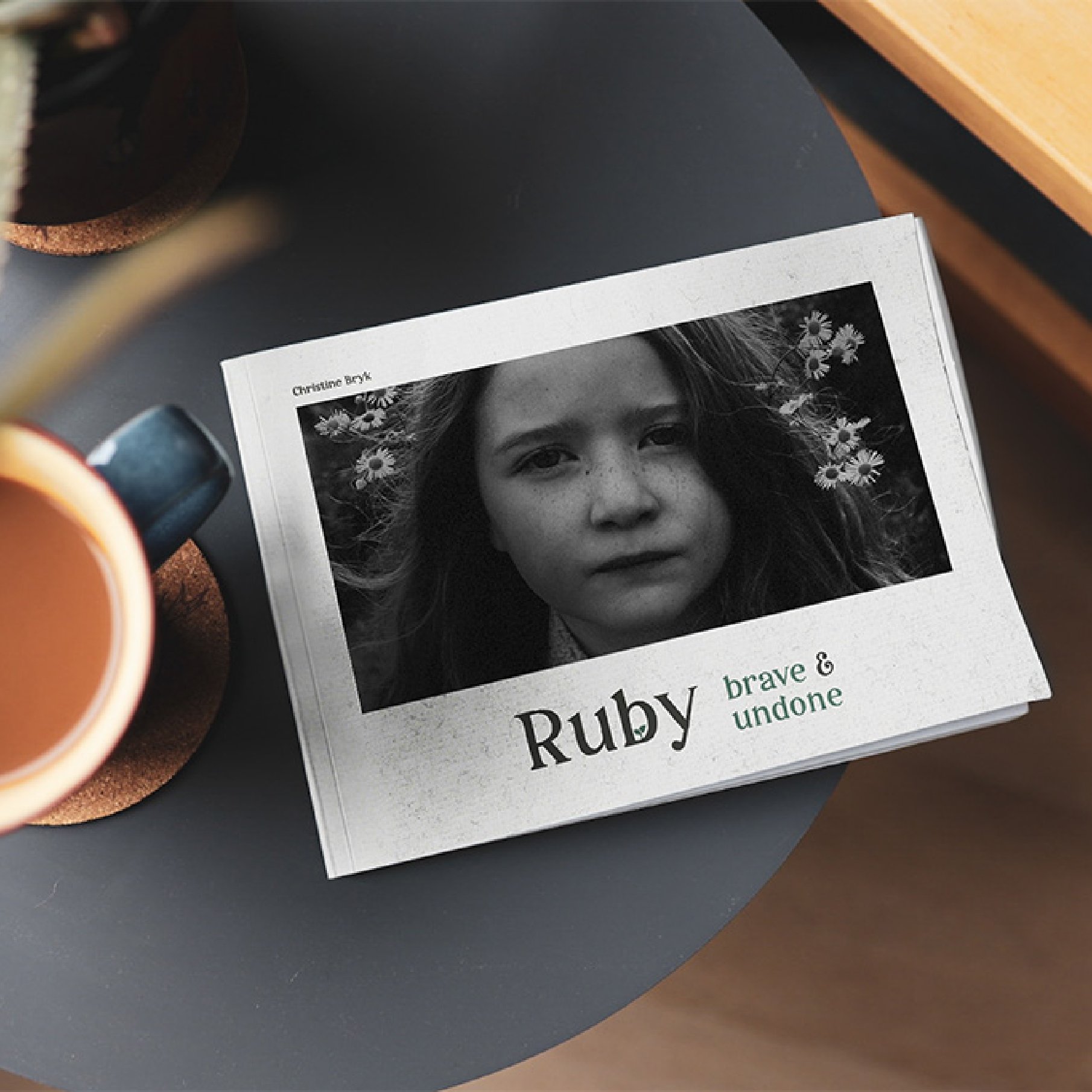
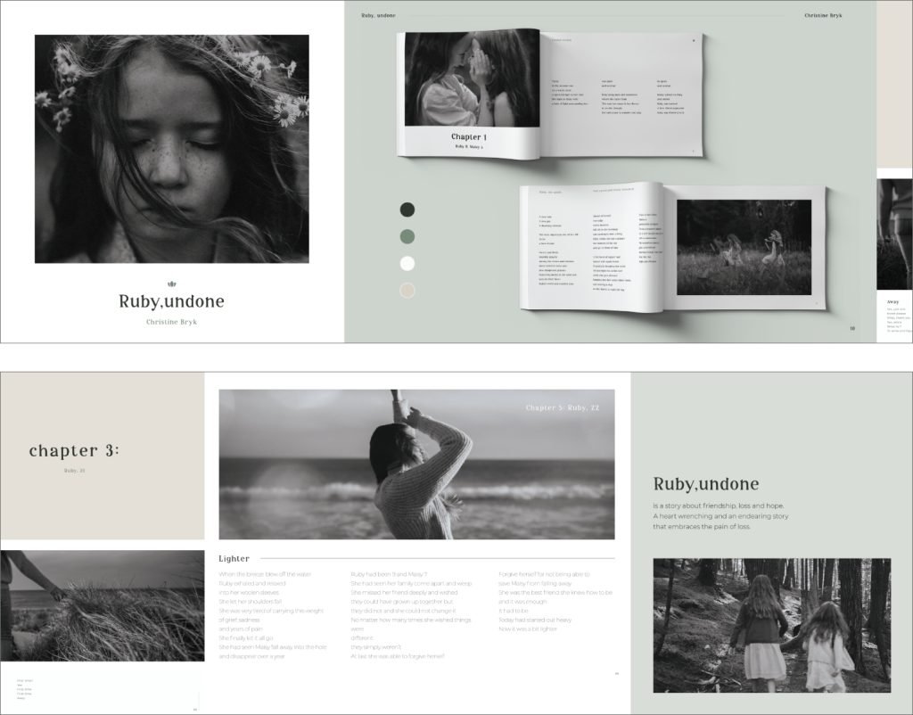
Deeply rooted in vulnerability and tenderness, the story of Ruby – brave & undone, takes the reader on an emotional journey. Warmly and whimsically created with metaphorical references to nature, Christine Bryk explores experiences of profound loss and grief.
V O I C E & T O N E
The book’s unique voice breaks away from the norm, turning every page into a conversation piece filled with vivid metaphors of how Ruby overcomes her grief and loss.
Discovery
In the initial stage of product development, my focus was on truly understanding the problem Christine aimed to solve, identifying her target audience, and grasping her vision, mission, and goals. This foundational step is crucial for unraveling the book’s story. To get to the heart of it, I would engage Christine in insightful conversations—sometimes over a cozy phone call, perhaps with a glass of wine in hand.
Here are some of the key questions I explored during the Discovery phase:
Why should readers care?
What’s the driving force behind this book?
Why does this book need to exist?
What is your desired future state for the book?
How will you embody and live out the book’s purpose?
After gathering Christine’s responses, I meticulously synthesized the information to identify patterns and insights, which I then presented to her. This presentation aimed to ensure that Christine felt confident in her strategy and that her purpose was clearly aligned with her actions.
STRATEGY
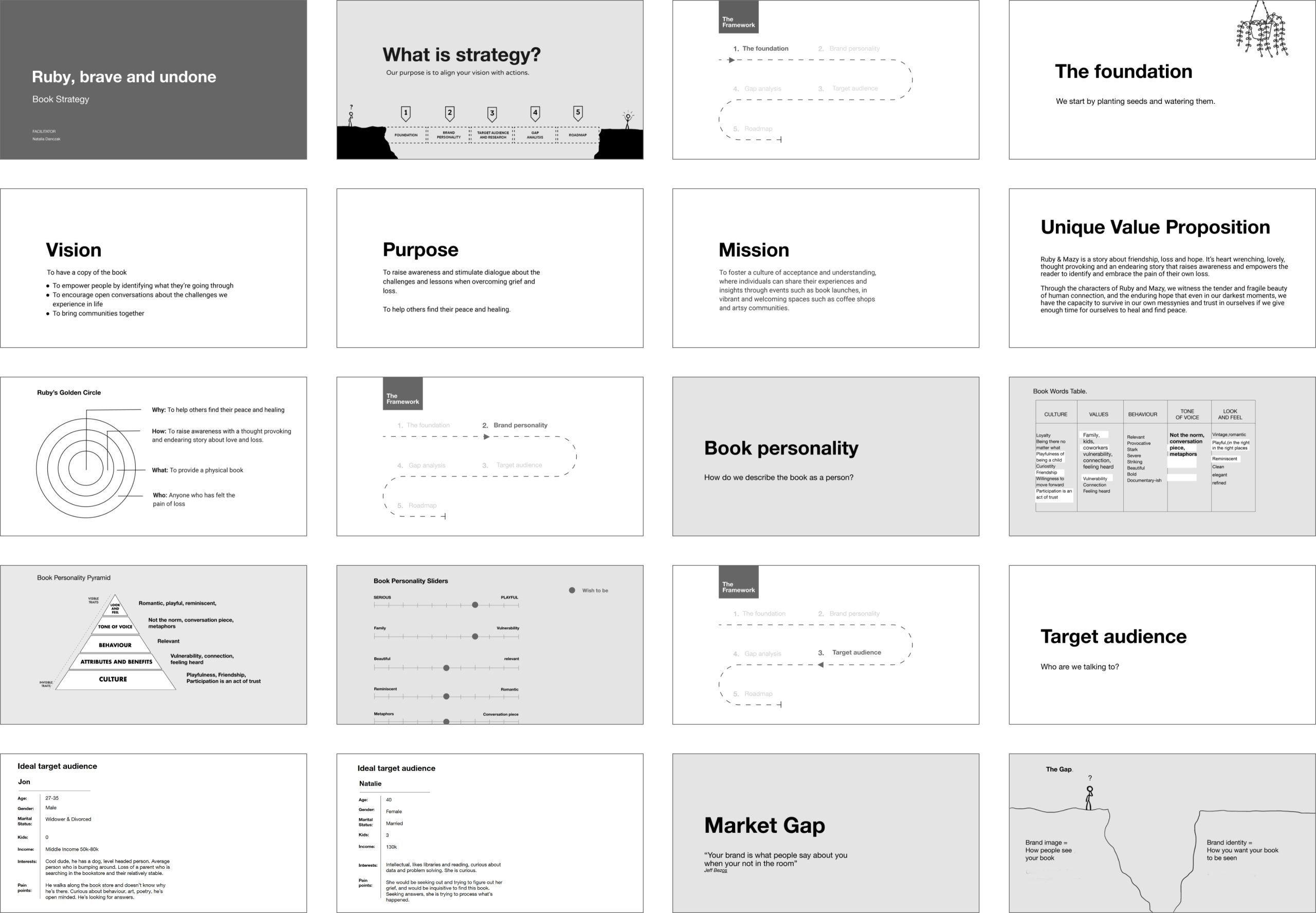
Ideate
With a clear strategy I moved onto the Design stage starting with creating a stylescape. A stylescape is the bridge between design thinking and visual design. The stylescape’s purpose is to showcase a carefully curated collection of images, textures, patterns, graphics, typography, and colours that collectively define the visual direction. By crafting this visual snapshot, I invite clients to actively participate in the creative process, helping to refine and solidify the art direction. The three key brand attributes we identified during the strategy phase—Friendship, Vulnerability, and Nostalgia—were woven throughout the stylescape, setting the tone for the entire design journey.
STYLESCAPE
Develop
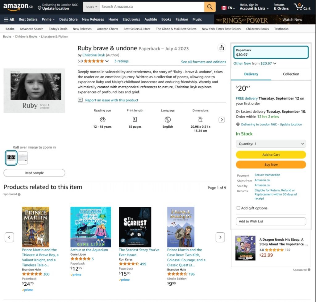
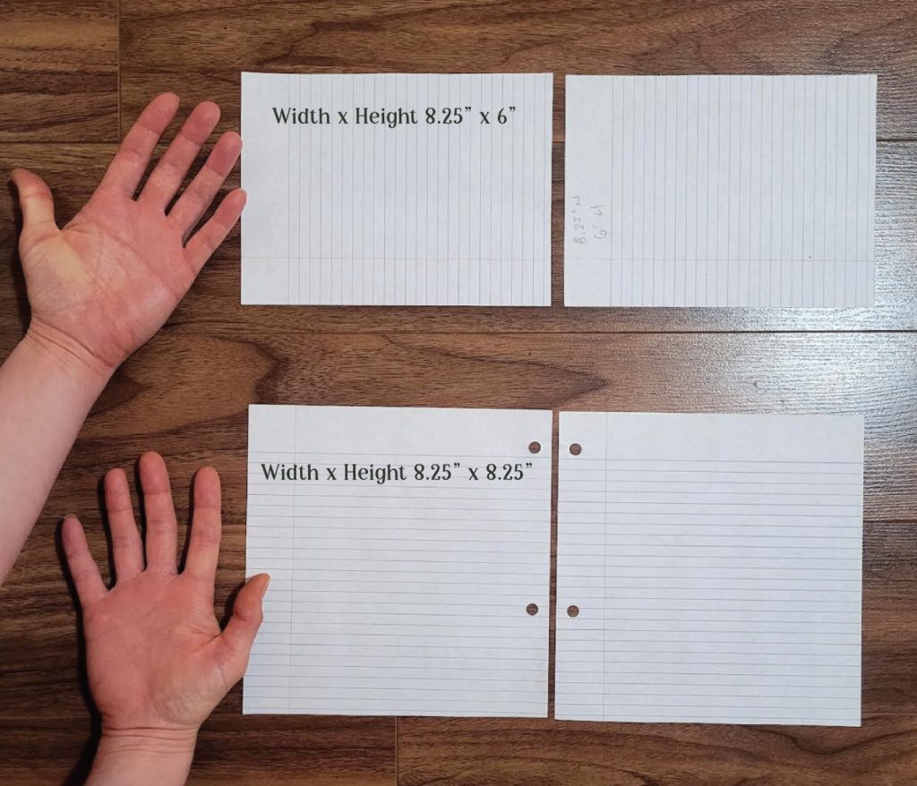
With the art direction in place, I transitioned into the development stage. This involved designing the logo, determining the book’s dimensions, and crafting the various components within its layout. Christine had been promoting her book by word of mouth and was gearing up to attend a retreat in the fall of 2023, where she planned to sell her book. As she opted for the self-publishing route, I explored two options: publishing on Amazon or working with a local print shop in Nova Scotia, paired with promoting her book on a dedicated website.
Considering the time-sensitive nature of having books ready for her retreat and the need to keep upfront costs low, Christine decided to publish on Amazon. After reviewing the available book sizes, we found that the 8.25″ x 6″ format best supported the storytelling layout, making it the ideal choice for her project.
BOOK SIZE
LOGO
SUBMARK & STACKED LOGO
CHAPTERS
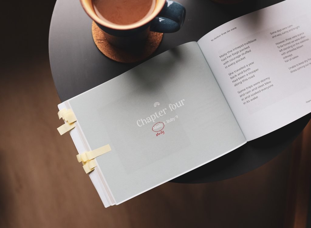
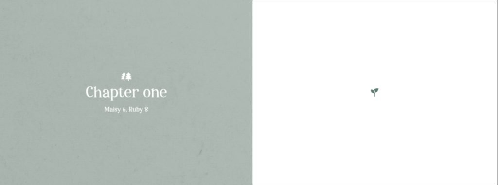
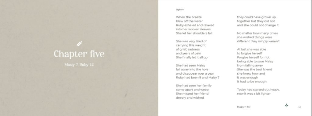
The book’s narrative starts with Ruby’s childhood, then transitions into her adult life, interspersed with flashbacks to her early years. To help readers effortlessly navigate these shifts in time, each chapter clearly states the ages of the key characters. For example, in Chapter One, Maisy is 6 and Ruby is 8. As Ruby’s story moves into adulthood, Maisy’s age remains frozen, symbolizing Ruby’s growth and her reflective journey into the past.
PHOTOGRAPHY LAYOUT & TONE
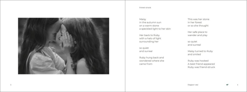
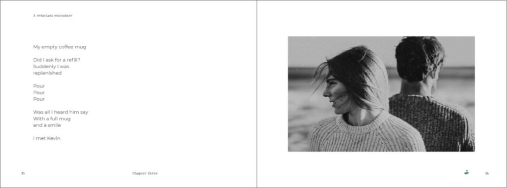
Building on the theme of reflection and moving forward, the placement of images in the book is intentional. In Ruby’s childhood scenes, the images are positioned on the left, symbolizing reflection on the past. In her adulthood, the images shift to the right, representing progress and the present moment. As readers turn the pages, they either move forward or linger in the past, mirroring Ruby’s journey. The photography is presented in black and white to complement the text, ensuring the imagery enhances the poetry without overpowering it.
FLIP BOOK ANIMATION
The theme of growth around grief is beautifully illustrated through a flipbook animation in the book, where a small seedling gradually grows into a mighty oak tree. This imagery symbolizes how grief, remains with us, ever-present as we grow and evolve.

COLOUR PALETTE

Implement
A few other key cost considerations were the page count and the use of colour. The final book ended up being over 80 pages, featuring black and white images. Before publishing, we needed to test Amazon’s printing services and thoroughly proof the book for colour accuracy, copy, layout, page order, and more. After two rounds of proofing, we were confident everything was just right and ready to publish on Amazon.
PUBLISHING
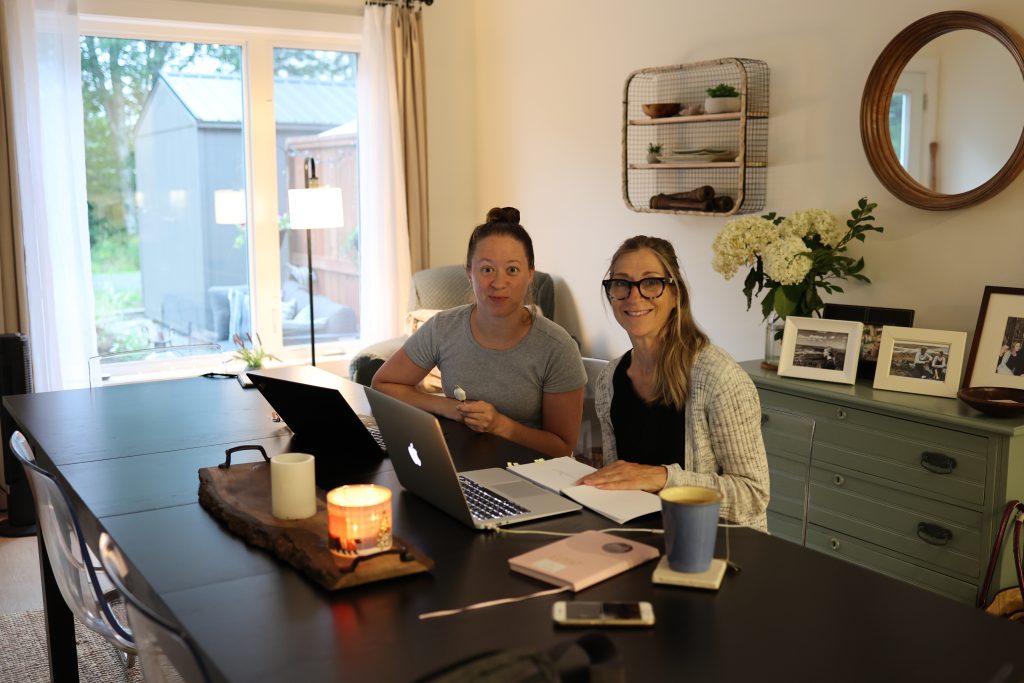
Christine and I spent a cozy afternoon in her Nova Scotia home, preparing to publish her book on Amazon with a cup of tea and some ice cream by our side.