
Connecting the dots between three brands
Defining a parent company’s DNA with a cohesive brand strategy framework to unify its affiliates, while designing a new website to support new growth.
Project type: Brand strategy & website design
Role: Sole UX/UI designer
Industry: Food & Beverage
Overview
01. DISCOVER
02. DEFINE
03. DEVELOP
04. DELIVER
01.
Discover
The business and it's customers
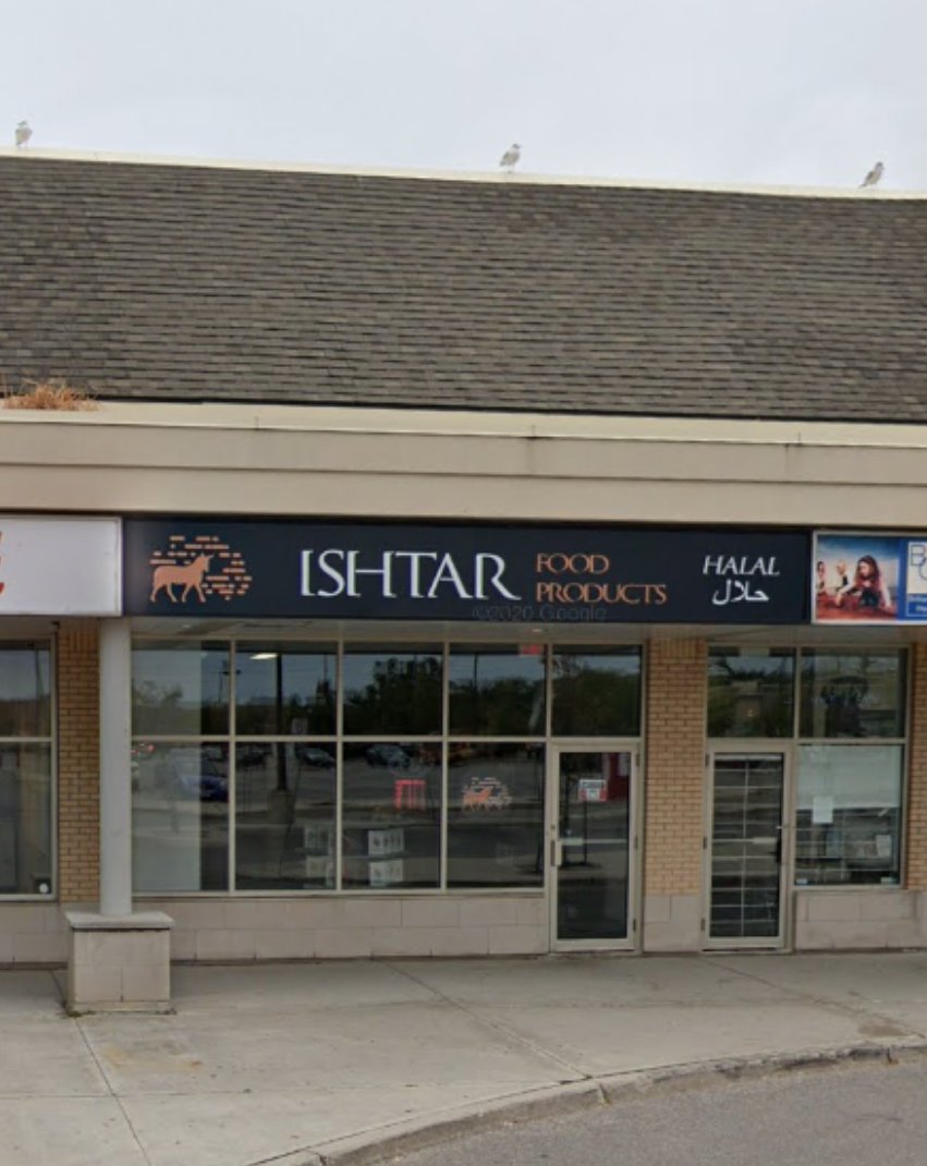
Ishtar is a family-owned Iraqi catering business with a frozen food store in Mississauga, Ontario, serving the Greater Toronto Area. The store specializes in Halal frozen food products that are ready to cook and serve, bringing authentic flavors to their customers’ tables.
Ishtar Canteen is the primary focus in this case study.
The brand problem
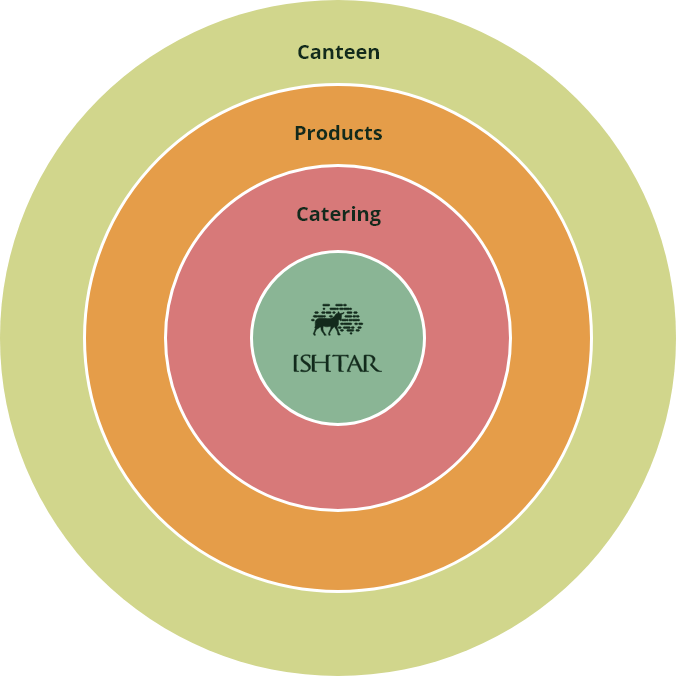
Ishtar operates three brands—Ishtar Catering, Ishtar Products, and Ishtar Canteen. However, the relationship between these brands and their connection to the parent company, Ishtar, was unclear. The owner wanted to increase brand awareness in hopes of generating more revenue and growth.
Brand architecture
Brand architecture defines the relationships between a parent company, its subsidiaries, products, and services. For Ishtar, the challenge was to position itself as the core of the brand, with its subsidiaries as ripple effects that extend its mission and values.
At its heart, Ishtar is about bringing people together. This central idea became the foundation for aligning the brand architecture:
Why do customers shop in-store?
According to the owner, customers are drawn to the store for its authentic, high-quality Halal food and the sense of connection they experience while visiting. The experience extends beyond food—it’s about brightening their day and fostering community.
Research goal
Understand what young customers seek in a Halal restaurant.
Research objectives
Learn what young customer’s goals and pain points are
Identify ways to differentiate
Ishtar from competitors
Map the buyer’s journey
Getting to know our competitors
I analyzed websites and online presence for three restaurants:
- Shawarma X: A mid-sized restaurant with a minimal menu.
- Albashawat: A small, casual restaurant steadily growing.
- Joummar: A high-end restaurant emphasizing history and tradition.


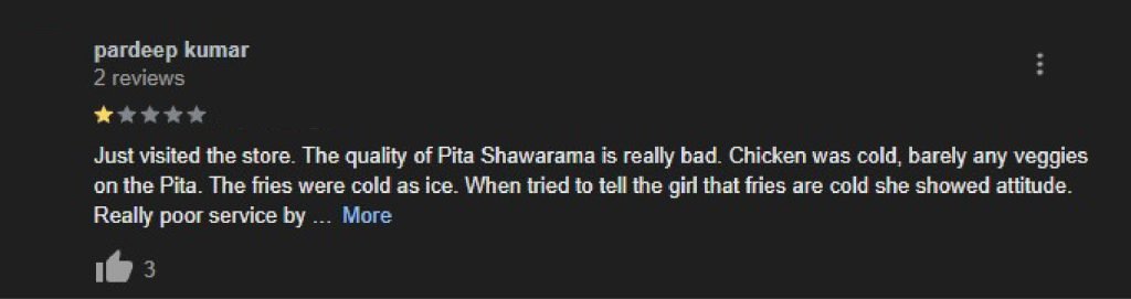
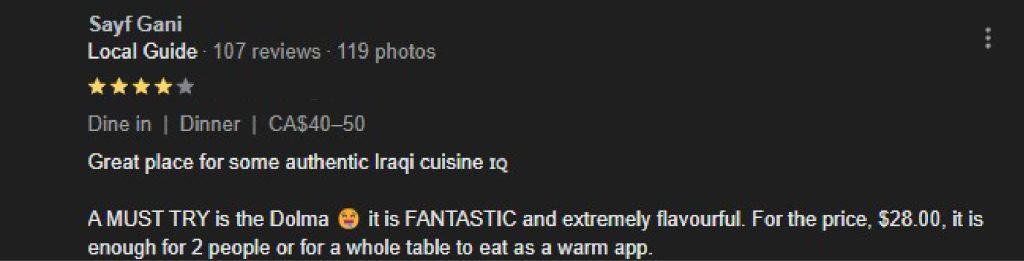
What are young people saying?
Through review analysis, I uncovered key pain points and goals:
- Freshly prepared Halal food
- Diverse and high-quality menu options
- Authentic Iraqi dishes that evoke a sense of home resonate strongly
- Proximity and easy access

02.
Define
The brand solution
- Unify Ishtar’s three distinct brands under one cohesive parent brand.
- Launch a new restaurant called Ishtar Canteen to appeal to younger audiences. The website and store would integrate offerings from all subsidiaries: frozen food products, catering, and dining experiences.
Where does Ishtar Canteen fit in the market?

A perceptual map highlighted market gaps and opportunities
for Ishtar Canteen to differentiate itself.
Market insights
- People want authentic, affordable food but lack time to cook.
- Dining is often a shared experience with friends or family.
- Customers value welcoming spaces that leave them feeling uplifted.
Research insights
Learn what young customer’s goals and pain points are
Insight:
Young customers seek new experiences with diverse and authentic Iraqi foods
Identify ways to differentiate Ishtar from competitors
Insight:
Focus on creating memorable moments that build meaningful connections with customers
Map the buyer’s journey
Insight:
Proximity, accessibility, uniqueness, pricing, and overall experience guide decision-making
Connecting the dots
During the Discovery stage, collaboration with Ishtar’s owner, Basmel, helped define the company’s core purpose, vision, mission, and values. The concept of bringing people together emerged as the central alignment for the brand. The resulting brand architecture positioned Ishtar at the core, with its subsidiaries acting as ripple effects that extend this mission. This clarified the previously unclear relationships between the brands and reinforced their collective identity.
Ishtar
brings people
together.
Ishtar Catering
crafts memorable
experiences that are
worth sharing.
Ishtar Products
provides high-quality
handmade frozen foods
to fit within your budget.
Ishtar Canteen
aims to build genuine
connections by brightening up someone’s day through
authentic Iraqi food.
Personas
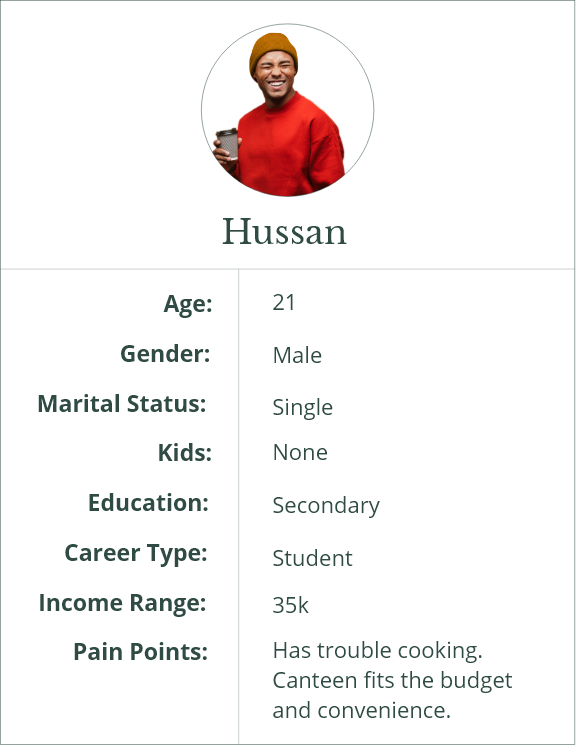
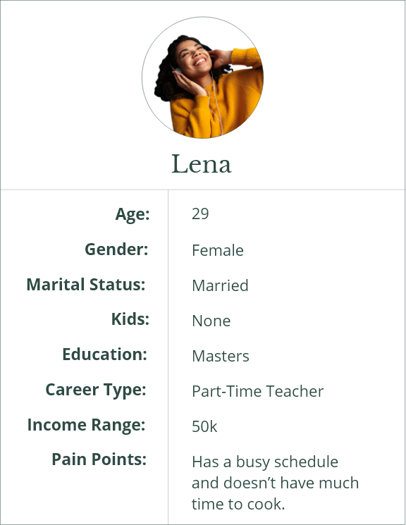
Based on research insights, two personas were created:
- Hussan: Is in his early 20s, he enjoys basketball and socializing with friends.
- Lena: Is in her late 20’s, she is married and works as a part-time librarian while pursuing night school.
These personas reflect the lifestyles and needs of the target audience, shaping the design approach.
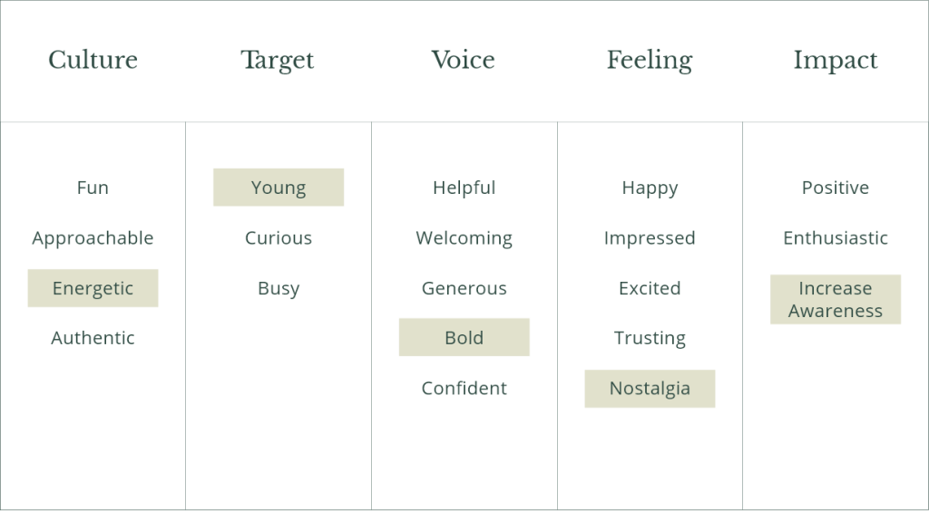
Narrowing down Canteen's brand attributes
By brainstorming and prioritizing brand attributes in various categories we were able to pinpoint what the brand would look like and how to tell our story.
- Culture: How would our community describe us?
- Target: How would we describe our target audience?
- Voice: How do we want to sound to others?
- Feeling: How do others feel after being in contact with us?
- Impact: What tangible impact do we have on others?
03.
Develop
Finding a visual style for the Canteen brand
With the brand attributes narrowed down to Energetic, Bold, and Nostalgia, I created two stylescapes to define the visual style. Stylescapes are the bridge between design thinking and visual design. These are the collection of highly curated images, designs, type, textures, and colours that help define visual direction. The owner decided to move forward with option 1.
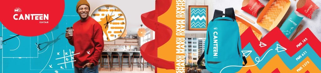
Option 1 – the stylescape is a spicy version
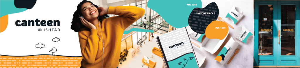
Option 2 – the stylescape is a subtle and mild version
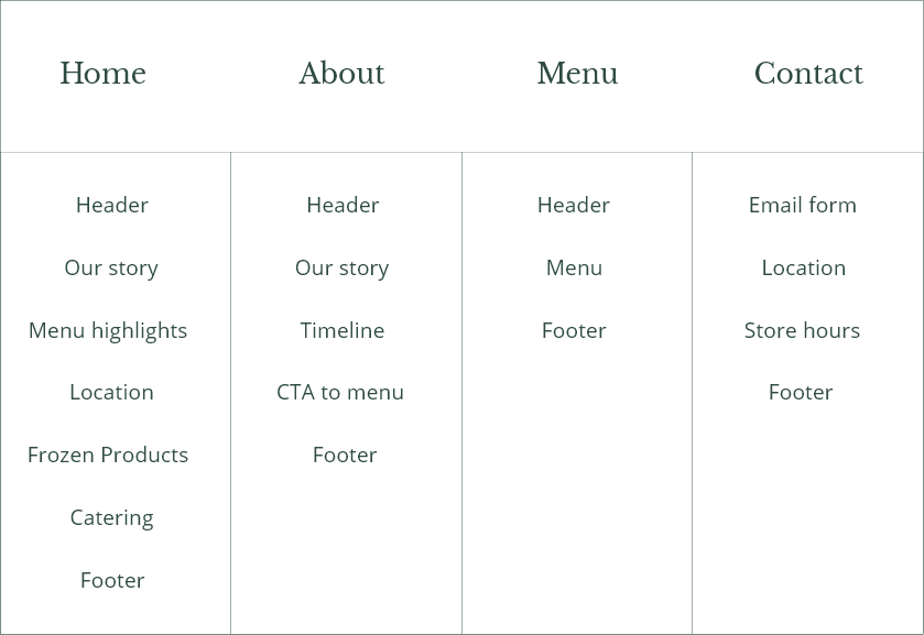
Information architecture
To showcase meals while integrating content from all brands, I used information architecture to prioritize user expectations and business goals.
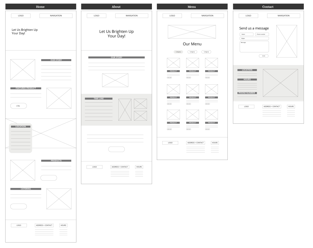
Lo-fi wireframes
While creating low-fidelity wireframes, I focused on:
- Keeping information clear and concise, by using only essential information.
- Ensuring mobile responsiveness.
04.
Deliver
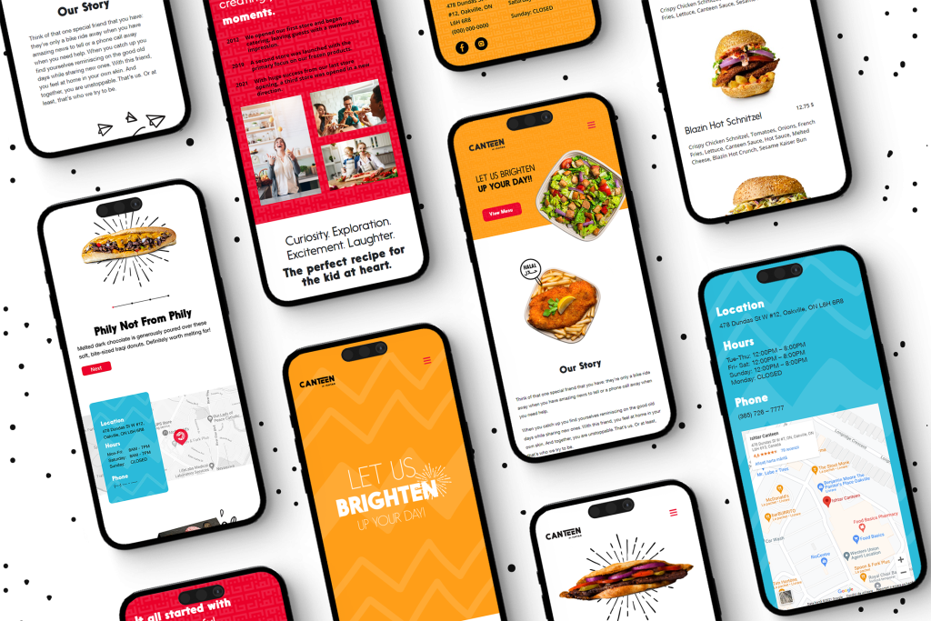
The final solution
The final version of Ishtar Canteen’s website achieved alignment between the parent brand and its subsidiaries, providing a seamless user experience and supporting the brand’s growth objectives.
What I learned
An AODA compliant colour palette helps everyone: white text can sometimes be tricky on bright coloured backgrounds. In the future I would do an in-depth testing on a brand’s colours for different situations and touchpoints.
Designing for the user is the most rewarding part of the process. When a business is aligned with their target audience and themselves its exciting to be a part of the future growth.
